PracticalResponsiveTypography
by Scott Kellum
PracticalResponsiveTypography
by Scott Kellum
Words are how we communicate.
Typography is the voice we give to written words.
Let’s Look At
Some Examples
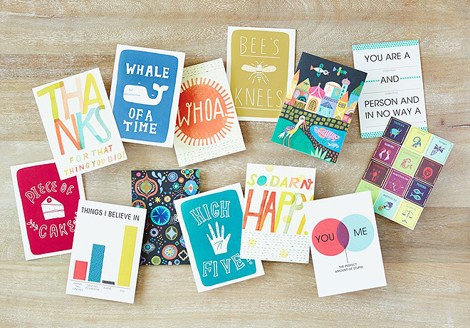
With typography,
you are looking for a voice that is
appropriate for its context.
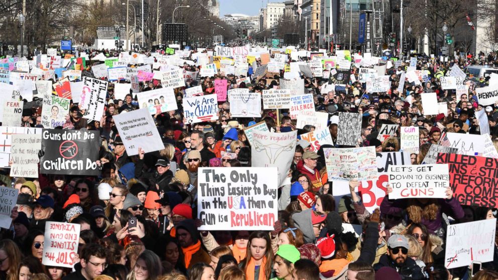
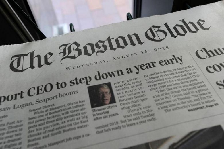
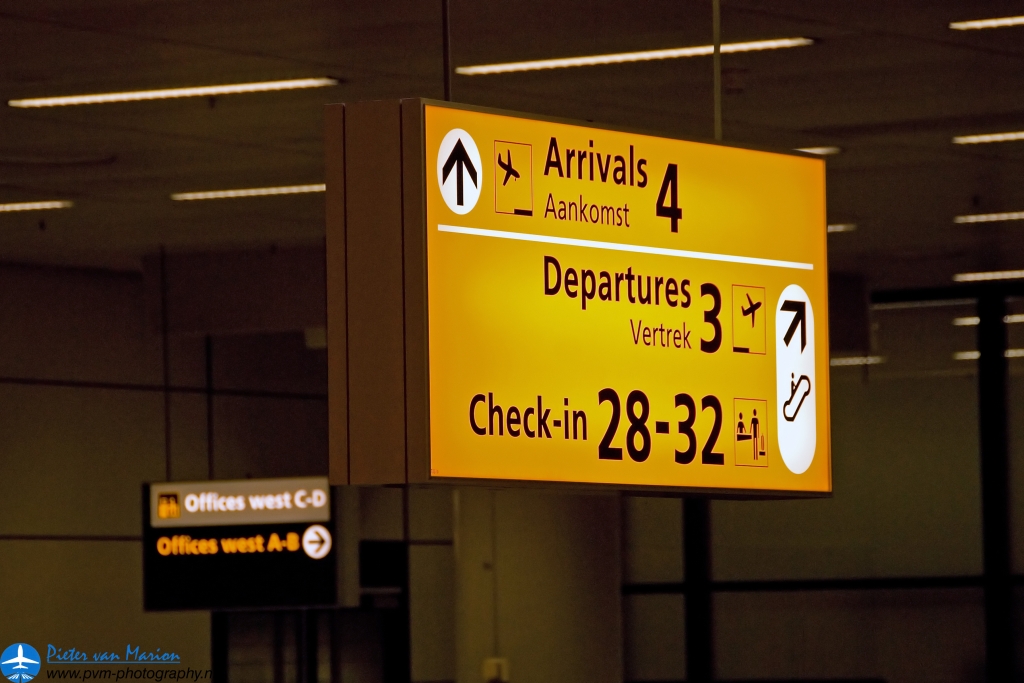
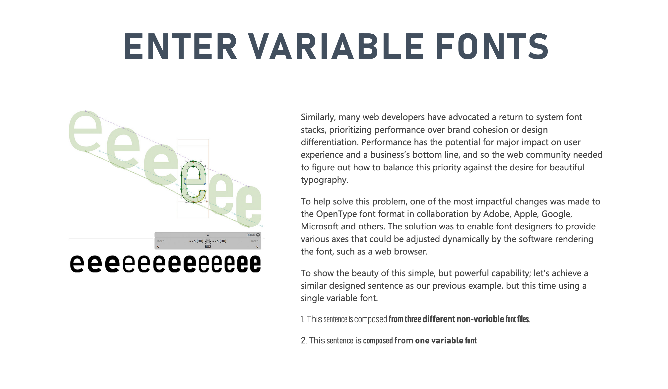
Typography Has Utility
:root {
  font-size: 120%;
  line-height: 1.4;
  font-family:
    "Obviously Variable",
    sans-serif;
  font-variation-settings:
    "wght" 300,
    "wdth" 400,
    "slnt" 0;
}| Net income | $3,283,483.28 |
| Expenses | $1,317,181.11 |
| Profit | $1,966,302.17 |

This exotic bird was just a seagull doused in curry
An exotic-looking bright orange bird was rescued after people saw him on the side of a highway, but according to an animal hospital, it was a seagull somehow covered in curry or turmeric, which prevented him from flying properly.
This exotic bird was just a seagull doused in curry
An exotic-looking bright orange bird was rescued after people saw him on the side of a highway, but according to an animal hospital, it was a seagull somehow covered in curry or turmeric, which prevented him from flying properly.
PracticalResponsiveTypography
by Scott Kellum
San Francisco
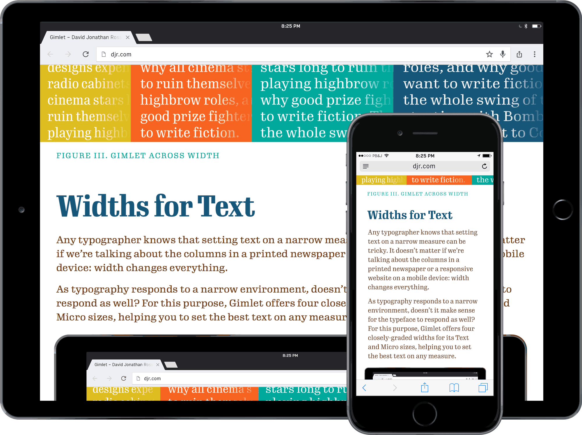
Fluid Typography
- Balance font size and line length
- As line length grows, so should line height
- Have a consistent type scale
“Anything from 45 to 75 characters is widely regarded as a satisfactory length of line for a single-column page set in a serifed text face in a text size.”
— Robert Bringhurst, The Elements of Typographic Style

max-width: 60ch;Font Size
Line Height
Typographic Hierarchy

Tools for responsive typography
- Media Queries
- CSS Locks
- Typetura.js
CSS Locks
calc(
  12px + (24 - 12) *
  (
    (100vw - 400px) /
    (800 - 400)
  )
)
font-size: calc(12px + 3vw);
calc(
  12px
)
calc(
  12px + (24 - 12)
)
calc(
  12px + (24 - 12) *
  (
    100vw
  )
)
calc(
  12px + (24 - 12) *
  (
    (100vw - 400px) /
    (800 - 400)
  )
)
clamp(12px, 3vw, 24px)
vw
Typetura.js
CSS Keyframes
to element width
Thank you
- WordPress and WordCamp
- OH no Type Company
- Sal Hernandez
- Ana Monroe